
Most sellers treat hang tags as an afterthought. They print whatever fits, pick any font, and wonder why their product looks cheap next to a competitor’s. This guide fixes that with real specs, real decisions, and no filler. You spend months getting your product right. You obsess over the formula, the finish, the packaging box. Then you slap on a generic tag with white cardstock, Times New Roman, price in the center and call it done.
That tag is the last thing a customer sees before they decide whether your product is worth the price. In a Clemson University study on hang tags and consumer behavior, shoppers noticed tagged products before untagged ones – and the tag itself influenced whether they picked the item up. The tag isn’t decoration. It’s a selling tool.
This guide walks you through every decision you need to make size, layout, material, file setup, and the mistakes that are costing brands credibility every day. No vague advice. Just what actually matters when you’re ordering custom hang tags.
Your Hang Tag Is Your Brand’s First Physical Impression
Before a customer reads your product description, before they check the price, they hold your tag. That moment maybe two or three seconds is when they form their first opinion about your brand’s quality. Research on consumer buying behavior shows that color alone increases brand recognition by up to 80%, and nearly 85% of consumers say color is the primary reason they choose one product over another. That applies to your hang tag just as much as your packaging.
“A hang tag tells the customer what kind of brand they’re dealing with – before they read a single word on it.”
The brands that understand this treat their hang tags as a branding asset, not a label. They match the tag weight, finish, and typography to the product’s price point. A $12 candle and a $90 candle can sit side by side but their hang tags will tell you immediately which one is worth the higher price.
So let’s build one that does its job.
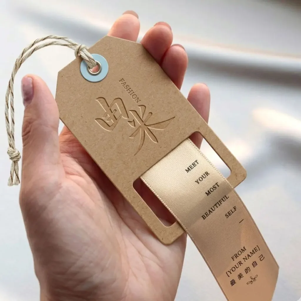
Pick the Right Size for Your Product
The single most common mistake first-time buyers make is guessing the size. They order 2″ × 4″ tags because it sounds about right, then realize the tag overwhelms a small jewelry piece or gets lost on a jacket. Here’s how to think about it: your tag should never be wider than one-third of the product it’s attached to. Beyond that rule, the amount of content you need to fit determines everything else.
| Size | Best For | Content Capacity | Notes |
|---|---|---|---|
| 2″ × 3.5″ | Jewelry, cosmetics, small accessories | Logo + price only | Same size as a business card. Compact but limited space. |
| 2″ × 4″ | Clothing, candles, retail goods | Logo, price, short details | ★ Most popular size in the US — accounts for ~60% of all hang tags printed. |
| 2.5″ × 4.25″ | Apparel with care instructions | Full front + back use | Extra length gives room for washing instructions on the back. |
| 3″ × 5″ | Gift items, luxury products | Brand story, QR code, full info | Feels substantial. Works well for premium branding. |
| Folded tags | Any product needing 4 print surfaces | Maximum content space | Opens like a booklet. Great for detailed care + brand story without sacrificing front design. |
When to Use a Folded Hang Tag
If you find yourself shrinking your font past 8pt to fit everything, stop – and switch to a folded tag instead. A folded 2″ × 4″ tag gives you 8 square inches of total print area across four panels. The front stays clean (logo, brand name), the inside holds your care instructions or product details, and the back carries your website and social handle.
Quick Rule
Primary text: 10pt minimum. Body text: 8pt absolute minimum. If something has to go below that to fit, it doesn’t belong on the tag – move it to a folded interior or your packaging.
Decide What Goes on the Front and Back
A hang tag is not a brochure. It has two jobs: tell the customer who you are, and give them the information they need to buy with confidence. Every element on the tag should serve one of those two purposes. If it doesn’t, cut it.
The Front: Brand Identity Only
Keep the front clean. That means your logo as the dominant element, your brand name or tagline in secondary size, and nothing else unless it’s essential. Three visual elements maximum. The temptation to add product photos, pattern backgrounds, or multiple taglines is real resist it. Your logo should take up 40–50% of the front face. If it doesn’t read clearly at that size, the logo itself may need work before you move to print.
The Back: Information Zone
- Price – clear, readable, with currency symbol
- Product details – size, weight, material, or variant where relevant
- Care instructions – mandatory for clothing and fabric items
- Website URL – short and memorable, not a campaign URL that’ll expire
- Social handle – one platform only, the one where you’re most active
- QR code – optional but increasingly valuable (more on this below)
The QR Code Opportunity Most Brands Skip
A QR code on your hang tag turns a one-time sale into a relationship. Link it to a product video, a review page, a loyalty program sign-up, or an Instagram profile. One apparel brand I’ve seen links their QR code directly to a “how to style this piece” guide – a simple move that keeps customers engaged after they’ve already bought. The code itself should be at least 0.8″ × 0.8″ to scan reliably. Anything smaller and cheap phone cameras struggle with it. Test it with multiple devices before you go to print.
Get the Visual Hierarchy Right
Visual hierarchy is the order in which a reader’s eye moves through your design. On a hang tag, you control that order – or you let chaos control it. Here’s what to lock in before you touch any design software.
The Three-Level Rule: Big → Medium → Small
Every hang tag should have three clear levels of visual weight:
- Level 1 (largest): Your logo or brand mark – the thing people remember
- Level 2 (medium): Brand name or product name – confirms what they’re looking at
- Level 3 (smallest): Supporting text – price, tagline, web URL
When all three levels are the same size, the eye doesn’t know where to land. The tag reads as visual noise. Equal weight = no weight.
Font Pairing for Small Formats
Use two fonts, not three. One display font for your brand name (a serif or distinctive script that carries personality), and one clean sans-serif for all informational text. The display font does the branding. The sans-serif does the communicating.
Two critical constraints for print at this scale:
- No hairline or ultra-light font weights – they collapse during printing, especially on uncoated stocks
- No decorative or script fonts for body text — if it’s hard to read on screen at 12pt, it’s unreadable on print at 8pt
Color: CMYK, Contrast, and the RGB Trap
Your screen displays color using RGB light. Your printer applies CMYK ink. These are different systems, and some colors that look bold on screen – particularly neons and bright blues – shift significantly or become muddy in print.
Design in CMYK from the start. If your brand uses a specific Pantone color, match it in CMYK before you build the file. The difference between Pantone 485 (fire red) and its closest CMYK equivalent is subtle on screen but visible on paper – especially on uncoated stocks like kraft, which absorb ink differently than coated cardstock.
Common Mistake
Designing in RGB, exporting to PDF, and hoping the printer will fix it. They won’t – or can’t. You’ll receive tags where your deep navy logo printed as a washed-out grey-blue. Convert to CMYK before you start designing, not after.
White Space Is Not Wasted Space
Every print designer knows this, and every first-time hang tag buyer ignores it: crowded tags look cheap. The brands that command higher prices give their design room to breathe.
Maintain a minimum 3mm margin between your design elements and the edge of the tag. That margin serves two purposes: it keeps text readable, and it accounts for the safe zone required by printers to handle cutting tolerances. Put text inside that 3mm zone and you risk it getting trimmed off.
Choose Your Shape, Material, and Finish
The material and finish you choose should match your brand’s position in the market – not just what’s cheapest or fastest to order. A luxury candle brand on 16pt glossy cardstock looks wrong. A handmade soap on heavy 400gsm uncoated kraft looks right. These aren’t accidents.
Shape Options
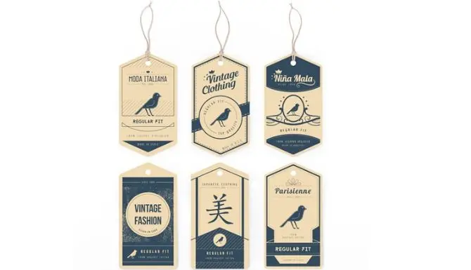
- Rectangle (sharp corners): Clean, modern, versatile. Works for most categories. Easiest to design for.
- Rounded corners: Slightly warmer and more approachable than sharp corners. Popular with lifestyle and wellness brands. The 0.25′ radius is the standard option.
- Oval or circular: Distinctive and boutique-feeling. Works well when the tag carries minimal text and the design leans visual.
- Custom die-cut: Any shape your brand demands. A clothing brand might use a dress silhouette. A coffee brand might use a coffee bag shape. Costs more but creates immediate visual recognition in retail.
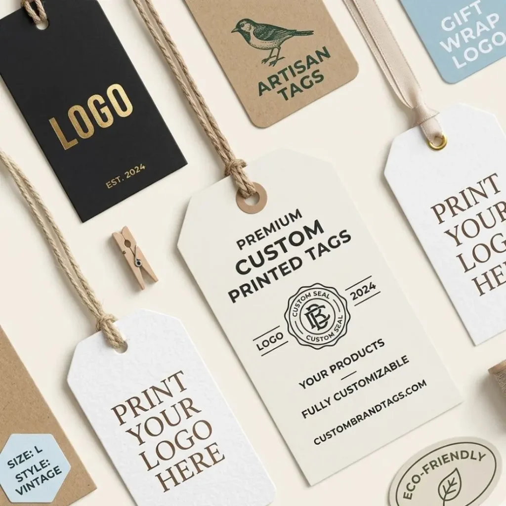
Material: What Your Stock Says About You
| Material | Feel | Best For | Note |
|---|---|---|---|
| Gloss Cardstock (14–16pt) | Bright, shiny, vibrant | Mainstream retail, colorful brands | Colors pop. Feels standard. |
| Matte Cardstock (16pt+) | Smooth, non-reflective | Premium, sophisticated brands | Feels more expensive. Fingerprint-prone. |
| Kraft Paper (300gsm) | Textured, natural brown | Artisan, eco, handmade goods | Ink absorbs differently — darker, earthier tones work best. |
| Recycled Board (300–400gsm) | Stiff, slightly rough | Sustainable brands, food, beauty | FSC-certified options available. Communicates eco values clearly. |
Weight matters as much as material. A 14pt tag feels flimsy and light it moves, bends, and looks disposable. A 400gsm tag feels substantial and premium before the customer reads a word. For most branded hang tags, 300gsm is the minimum worth ordering.
Finish Options That Do Real Work
- Matte lamination: Soft to the touch, no glare, premium feel. The safest choice for most mid-to-high-end brands.
- Gloss lamination: Vibrant colors, durable surface. Works for fashion brands that want energy and visibility.
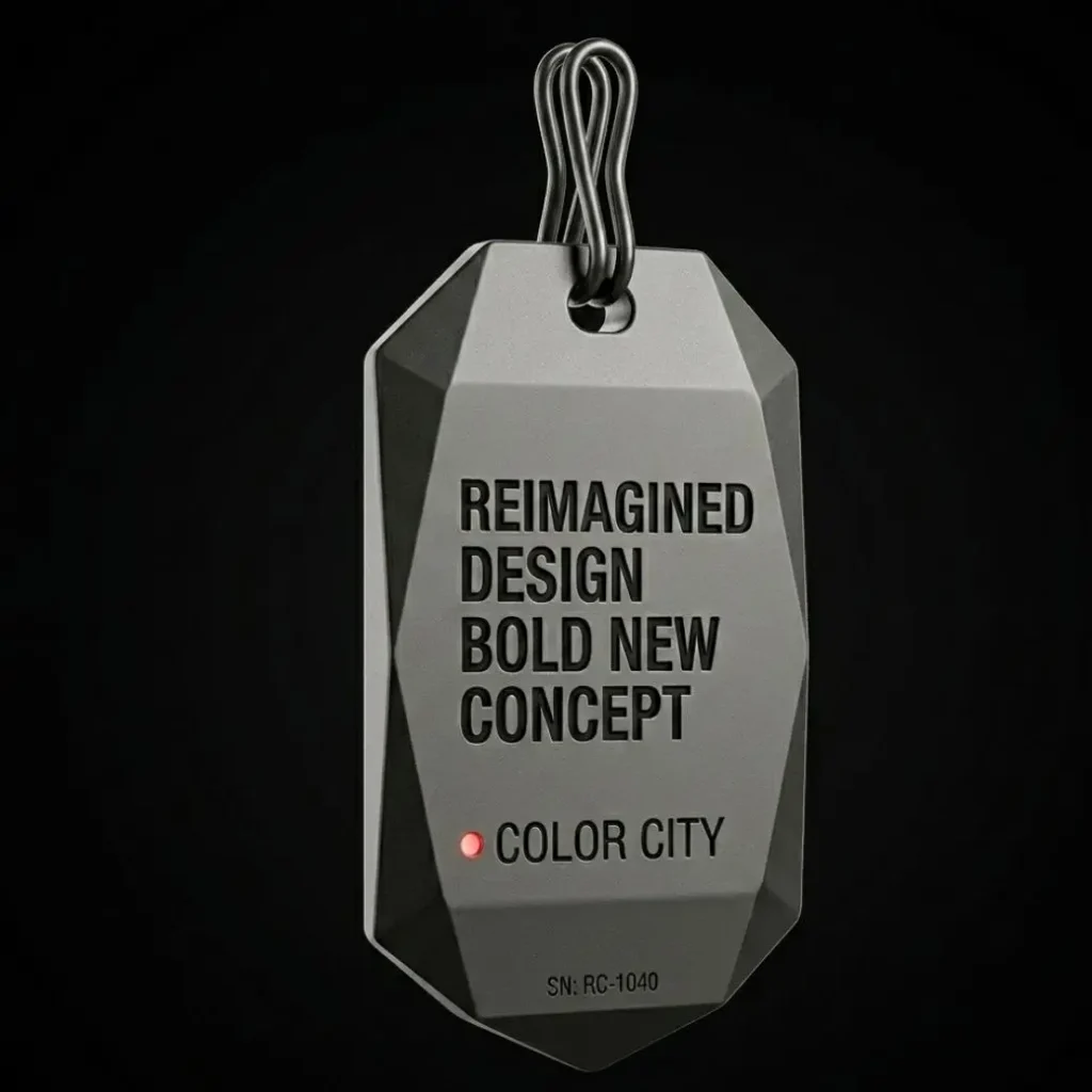
- Spot UV: A glossy coating applied only to specific elements — your logo, a pattern, key text. Creates a contrast between matte background and gloss accent that catches light in retail. One of the most effective finishes for standing out on shelf.
- Gold or silver foil stamping: Applied with heat and pressure. Instantly communicates luxury. Used by premium jewelry, fashion, and gift brands. Not cheap, but the ROI in perceived value is real.
- Embossing / debossing: Raises or presses elements into the surface. Tactile and memorable. Works especially well on uncoated stocks where the texture contrast is most visible.
Practical Tip
If budget limits you to one specialty finish, choose spot UV over foil. It costs less, works on more stock types, and the light-catching effect at retail is strong enough to justify the price difference over standard lamination.
Set Up Your File Correctly Before You Send It
More hang tag orders get delayed or come out wrong because of file setup errors than any other reason. Printers receive files in the wrong color mode, at too-low resolution, with no bleed, and with fonts that aren’t embedded. Every one of these is preventable.
Design Tools by Skill Level
- Canva (free/Pro): Good for beginners. Drag-and-drop, pre-built templates, exports to PDF. Set your canvas to CMYK if the paid plan allows it. Download as PDF Print (not PDF Standard).
- Adobe Express: Middle ground between Canva and professional tools. More control than Canva, easier than Illustrator.
- Adobe Illustrator / InDesign: The professional standard. Full bleed control, true CMYK color, vector output. If someone on your team knows these, use them.
- Affinity Designer: A one-time purchase alternative to Illustrator. Full CMYK and bleed support at a fraction of the cost.
If none of those work for you, Urgent Custom Boxes provides free design templates sized and spec’d for printing – download one, drop in your logo, adjust the colors, and your file is ready to submit.
Print-Ready File Specifications
| Format | PDF (preferred) or AI / EPS vector file |
| Color mode | CMYK — not RGB, not Grayscale |
| Resolution | 300 DPI minimum for all images |
| Bleed | 3mm (0.125′) on all four sides |
| Safe zone | Keep all text and logos 3mm inside cut line |
| Fonts | Embed all fonts or convert to outlines/paths |
| Hole clearance | Keep 5mm clear zone around the punch hole area |
| Double-sided | Two-page PDF (front page 1, back page 2) |
What ‘Bleed’ Actually Means
When printers cut your tags from a larger printed sheet, the cut line isn’t always perfect to the millimeter. Bleed is the extra design area – 3mm on every side – that extends beyond the cut line. If your background color or design element doesn’t extend into the bleed area, you’ll get a thin white strip along one edge after cutting. That white strip is the most common beginner mistake in print design, and it makes tags look unfinished.
Set your canvas size to your tag size plus 6mm on each dimension (3mm bleed per side). Design your background to fill the entire canvas. Keep your text and logo inside the safe zone. That’s it.
The Punch Hole: Don’t Forget to Account for It
The standard string hole is 0.25′ (6.35mm) in diameter for most hang tags, placed at the top center or top left. Here’s what most people miss: the hole takes up 5–8mm of your design space at the top of the tag. If you place your logo too high, part of it gets punched out. Mark the hole position on your design template before you start laying elements. Most printer templates include a marked hole zone for exactly this reason. Design around it, not over it.
5 Hang Tag Design Mistakes That Kill Brand Credibility
After seeing thousands of hang tag orders, these are the errors that come up consistently – and every one of them is avoidable with five minutes of attention upfront.
Designing in RGB and submitting without converting to CMYK
Your brand’s signature blue might look electric on screen and arrive as a dull blue-grey on paper. Bright neons are especially problematic — CMYK ink physically cannot reproduce them. Convert your file to CMYK before you build the design, not after. Switching modes at the end shifts all your colors at once and requires manual correction of every element.
No bleed — design ends exactly at the cut line
The result: a thin white border on one or two edges of your finished tag. It looks like a printing error even though the design itself is fine. Add 3mm bleed on all sides. If your design software shows a red border around your canvas, that’s the bleed area — fill it.
Text set below 8pt, or using hairline font weights
Designers often preview hang tags on a large monitor where 6pt text looks readable. On the physical tag, that same text is illegible without reading glasses. Minimum 10pt for anything important, 8pt absolute floor for secondary info. Hairline and extra-light weights lose their strokes under pressure on uncoated stocks — use regular or medium weights instead.
Placing logo or text directly over the punch hole area
A clothing brand once sent a design with their logo centered at the very top of the tag. The string hole was punched through the middle of the brand mark. Every tag had to be reprinted. Always mark the hole position on your template before you begin designing. Keep a 5mm clear zone around the hole — nothing important within that radius.
Submitting a low-resolution JPG exported from a screen-design tool
Images taken from a website, screenshots of logos, or exports from presentation software are typically 72–96 DPI — fine for screens, unacceptable for print. At that resolution, your logo will look pixelated and blurry on the finished tag. Minimum 300 DPI for all images in your file. If your logo only exists as a small PNG, ask your designer for the original vector file (AI or EPS) — it scales to any size without quality loss.
Ready to Order Your Custom Hang Tags?
Browse our full range of custom tags available in every size, shape, material, and finish. Free design templates included. Fast USA turnaround with free shipping.
Shop Custom Hang TagsFrequently Asked Questions
The most widely used size is 2′ × 4′, which accounts for roughly 60% of all hang tags printed in the US. For small products like jewelry or cosmetics, 2′ × 3.5′ (the same dimensions as a business card) is the standard. If you need room for care instructions or a brand story, consider a 2.5′ × 4.25′ tag or a folded format.
PDF is the preferred format — fonts are embedded, colors are locked, and what you see is what prints. AI and EPS files (vector formats) also work well. Your file must be set to CMYK color mode, 300 DPI resolution, and include 3mm bleed on all sides. JPG files work if they meet the resolution requirement, but vector is always preferable for logos and text elements.
300gsm (grams per square meter) is the baseline for a professional-quality tag that feels sturdy in the hand. For premium brands, 350–400gsm creates a noticeably substantial feel that adds to perceived product value. Tags below 250gsm feel flimsy and tend to curl, especially in humid conditions.
Yes — this is called die-cutting, and it allows you to order tags in any shape: oval, rounded rectangle, circle, or a fully custom silhouette that follows your logo or product shape. Die-cut tags cost more than standard rectangular tags, but they create immediate visual distinction in retail environments. Available at UrgentCustomBoxes in any shape you specify.
They’re the same product — ‘hang tag’ is the more common term in the US, while ‘swing tag’ is used more often in the UK and Australia. Both refer to a card attached to a product by a string, cord, or ribbon. The terms are interchangeable in any printing or design context.
Keep your primary text — brand name, product name — at 10pt minimum. Body text and secondary information should stay at 8pt absolute minimum. Anything below 7pt becomes unreadable on a physical tag at arm’s length. If your content doesn’t fit at these sizes, reduce the content — not the font size.
The Short Version
Pick the size that fits your product and content – not the cheapest option on the list. Separate your front (brand) from your back (information) and don’t crowd either one. Build your visual hierarchy around three clear levels. Choose a material and finish that matches where your brand sits in the market. Set your file up correctly before you submit it – CMYK, 300 DPI, 3mm bleed, fonts embedded, hole placement accounted for.
That’s the whole system. It’s not complicated, but skipping any one step shows up on the finished tag – and your customers notice, even if they can’t say exactly why. If you want to see what’s possible across sizes, shapes, and finishes, browse our full selection of custom printed hang tags. Free templates, design support, and fast USA shipping on every order.